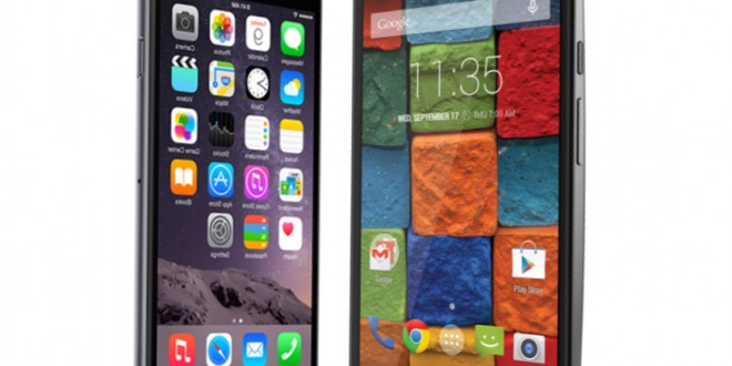
If you’re thinking about getting the newest and fastest phone on the market, you’ve probably considered the iPhone 6 and the Motorola Moto X. When it comes to style, both manufacturers are committed to delivering the hottest product they can. The iPhone already has legendary status as an icon of design. The cool aluminium, the sleek profile and simple shape make it a great accessory. Apple is constant in its zen approach to design. No big holes, annoying flaps or ugly buttons. They haven’t cut any corners with the new model, except for the literal corners, which have now been rounded for a more ergonomic feel. Gone are the days of the monolith phone, the clean-cut slate shape that defined the iPhone for the past 3 years. Motorola have also been design-centric since their beginnings. The Razr flip phone was one of their biggest hits, for its razor thin profile. They kept the Razr philosophy well into their smartphone era, with the Droid Razr, a slim phone with a big screen and an option for a big battery crammed into it. They’ve gone one step ahead into their design and the Moto X 2nd Generation making it more ergonomical.
Moto X 2nd generation, available now in stores, checks all the requirements of a premium Android phone. It has a Qualcomm 801 chipset with a 2.5 GHz quad core processor, 2 GB of RAM, sufficient for any normal user. The iPhone 6 is based on next-gen technology, a 64 bit architecture Apple a8 dual core with 1 GB of RAM. A direct comparison between the two is like apples and oranges – no pun intended. They both deliver well on performance. The Apple being a 1.4 GHz dual core is of no detriment to the phone, and having half the RAM can be justified by a totally different OS, which has less bloatware. The Safari browser was reported to be lag in the early release of the IOS 8, but with the update, it runs much smoother.
If you’re considering the iPhone, you definitely do not care about exact specifications. Apple gained a reputation of making devices that work. They make the hardware and software, so you won’t expect any issues with the device or apps its running. And you’re right to do so. With the Android phones it’s a different story altogether, you could run the same OS on a premium phone and a budget phone, and you will get different experiences. But since Moto X 2nd generation didn’t skimp on the technology, you can rest assured that you will get one of the best devices on the market.
In terms of battery life, the iPhone delivers as it always does: one day charge of medium to intense use. The Moto X 2014 is rated to last 24 hours on a charge with normal use. There’s no specification as to what normal use is, but it’s clear you might want to take more than 10 pictures on your night out, or you might choose to use your network instead of the coffee shop wi-fi which is always slow when the place is full. Normal use in the eyes of the manufacturer is never actual use, it’s always a bit less, so you’ll still have to recharge your phone every day. With a battery of 2300 mAh vs iPhone’s 1800 mAh it still has a slight edge though. So which one is better? The iPhone 6 vs Moto X 2014 has to be decided by design rather than functions, as they are both competent performers.
What you should really care about in comparing these two is the design – which fits you best. The Moto X promises a pure Android experience, with no excess bloatware. This is a very welcomed choice by Android users, as the bloatware of Samsung and HTC has always been criticized. The IOS 8 on the iPhone 6 is custom made for the device. The Zoom magnification function means it’s more user friendly than ever. The sizes are comparable with the Moto X being just 2 mm taller and 5 mm wider. The thickness is where it gets tricky: the iPhone is very slim, 6.9mm vs 10mm on the Motorola. But keep in mind, thin doesn’t mean more comfortable, the Moto has a curved back, making it fit in your hand much better. It’s very much like the HTC One M8 in this regard.
Pairing it with a leather back or a wooden one can really make your smartphone experience very enjoyable. The very thin bezel makes your phone more screen than case – which is the ultimate design, really. So yes, I dare say it: the Moto X 2014 beats the iPhone at its own game: great design. When you order it from the Motorola site you can customize everything, right there, in a very few easy steps. Choose from 25 different backs including 4 leather and 4 wooden ones. You can also choose from 10 metallic finishes.
If there’s one thing that makes users choose Android over iPhone it’s being different and having plenty of custom choices. The Moto X 2014 is the ultimate device in this regard. Oh, and one last thing: the Moto X 2014 is splash-resistant and costs roughly 150$ less.
 Load the Game Video Games, Reviews, Game News, Game Reviews & Game Video Trailers


