Alas, the Apple Watch has finally been unveiled after a year of excruciating rumor-spreading. The timepiece comes as an innovative piece of wearable tech running on Apple’s own watch OS, although we don’t have a name for it yet.
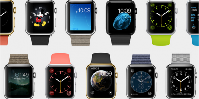
Apple seems to be putting emphasis on design and simplicity with the Apple Watch. Motorola on the other hand, prefers to advertise the functionality alongside the design of the Moto 360. The Apple Watch comes in two different sizes a 38 mm and a 42 mm version, with six different chassis (silver aluminium, stainless steel, space black stainless steel, space gray aluminium, 18 karat rose gold and 18 karat gold) and six different watchbands including the modern buckle, Milanese loop, leather loop, sport band, classic buckle and stainless steel link bracelet.
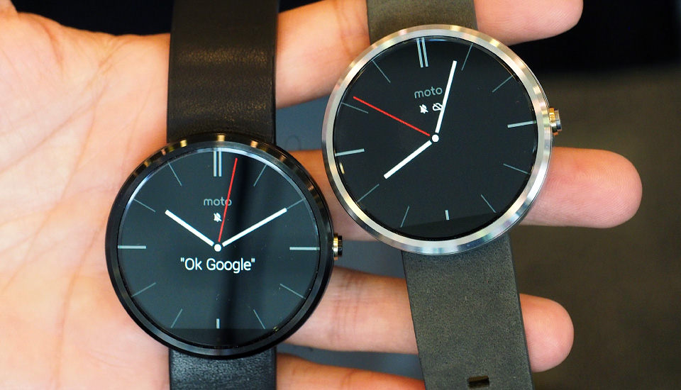
The Moto 360 on the other hand comes with a light or dark stainless steel case with a 46 mm diameter and three leather bands at the moment, stainless steel bands to be introduced by the holiday season. That’s not much compared to what the Apple Watch has to offer in terms of design versatility, but the Moto 360 has a round watch face, whilst the Apple Watch sports a square watch face. The choice between these two depends on the customer, because some people enjoy square watches, other prefer the more traditional watch face of the Moto 360 to that of the futuristic Apple Watch.
The Apple Watch has a sapphire Retina HD display which guarantees quality picture, but the Moto 360 isn’t far behind with a 1.56 inch 320*290 backlit LCD display at 205ppi, protected by Corning Gorilla Glass 3. The Apple Watch offers the more durable screen technology and a higher resolution and pixel density screen, so it’s the winner when it comes to display technology. Props for that.
Both watches have crowns, but Apple’s use of the crown is much more handy than that of Motorola. The crown on the Apple Watch is used to zoom, pan and scroll between the items displayed on your screen. The Moto 360 crown is used as the power button on the device. Since Apple has found a unique way of making effective use of the digital crown on the Apple Watch, it will surely be one of the favorite user features. 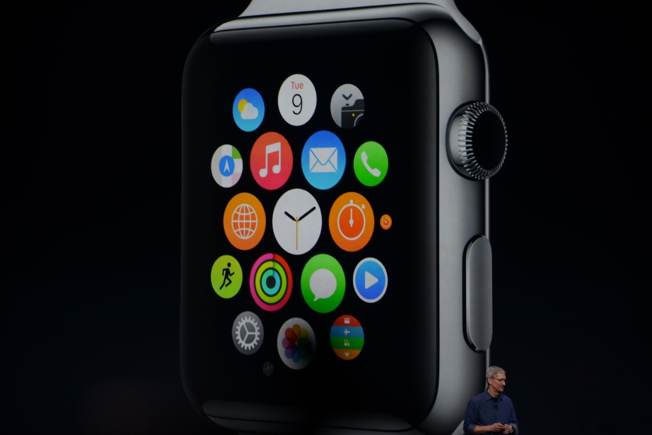
The Moto 360 runs Android Wear, with which we’ve been used to, and know that it is a very good wearable operating system which is continuously updated and developed further. You’ve got tons of apps, widgets and watch faces to choose from, but such is the case with the Apple Watch too. Though we don’t have a name for the OS it uses yet, it does offer fluid interaction and a high degree of customizability. Whilst Android Wear offers its share of health, fitness, gaming, messaging and calling apps, the Apple Watch focuses on other features like walkie talkie function, force touch (essentially a right-click you achieve by pressing instead of tapping), Friends and so on.
What’s interesting about the Apple Watch is that it offers heptic gestures, via a taptic engine. That means it sends little vibrations to your wrist whenever you get notified of something. The watch also acts as a text interpreter, not giving you a keyboard, instead giving you preset suggestions you can choose from when replying to a text. The standard voice recognition and Siri are also there. Both watches charge wirelessly, but we don’t know anything about the Apple battery, whilst the Moto 360 has either a 300 mAH or a 320 mAH battery incorporated.
Overall, when we think of features, the Apple Watch offers many new ones, but the Moto 360 offers the ones you are used to. That would mean that Android fans would probably prefer staying with Android Wear. Although the UI on the Apple Watch looks great from what we’ve seen so far, it does seem to have its shortcomings. 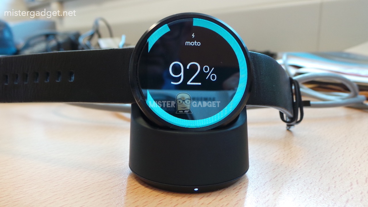
We know that the Apple Watch pairs with the iPhone 5 and up, but that’s all we know about connectivity. So the Moto 360’s Bluetooth 4.0 and Android 4.3 and up compatibility is better right now. We’re sure Apple will update the specs list on their website, but so far, the descriptions we find there focus on… well, appearance. The sensors on both the Moto 360 and Apple Watch are roughly the same, heart rate monitor included.
Now for the biggest difference. Apple Pay. The Apple Watch can function as an NFC payment method through Apple Pay, while the Moto 360 can’t really do that. That’s a big plus that can future-proof the device. Being able to use your watch to pay for stuff is quite a convenient solution for the wallet. The Moto 360 makes up for that by being IP67 certified. The Apple Watch is just water resistant, as far as we know.
The Moto 360 is currently sold out, but will be available soon again. The Apple Watch on the other hand, won’t be on the shelves until next year, probably that’s why we don’t know many of its specs, yet. The cheapest version of the Apple Watch will set you back $349 or even more if you don’t own an iPhone, because that’s all it works with. The Moto 360 is $250 right now, but that price might drop more with the release of the Apple Watch. 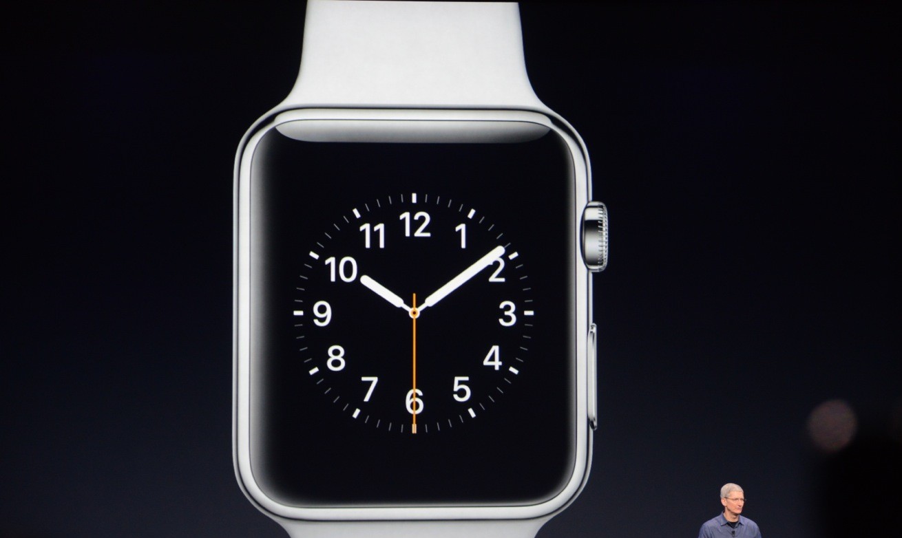
This is just a speedy comparison to tell you why the Apple Watch is better than the Moto 360 and why the Moto 360 might cater to a wider audience. We will be back with more information on the Apple Watch later, when all of its specs will be available and then we’ll be able to draft a more comprehensive comparison between the two.
Which would you choose if the two were offered to you for free RIGHT NOW? Not that I’m offering or anything. I would choose the Moto 360 because I’m a relentless Android fan and because I prefer the connectivity and design of the Moto 360 over the extravagant feature and design of the Apple Watch.
 Load the Game Video Games, Reviews, Game News, Game Reviews & Game Video Trailers
